You must enable JavaScript in your browser.
Voting is allowed only for registered users, you need log in.
Very good perspective and details!
so good angle.. the light enhance the saturated colours..
i made a variant with another crop.. it is not a correction to yours, as i think that is excellent.. just is another try, even towers remains too centred at mine
my variant of the photo
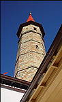
Hmm... Your solution is "right", "proper", but very "technical" I think...
yes, as i told you, it wasn't a correction.. i made that variant to try as an option , to see to avoid that white area..
maybe more an abstract, yes!
by the way.. i am sure that "right and proper", doesn't exist.. it is within each of us, the real rules ..
thank you so much for taking a look at variant!
Regarding "right and proper": please agree that if you shot a black sphere on a white table, and on the photo the sphere is placed into the middle of, this is indeed "right and proper", but not interesting  )
)
yess.. but who may assure that middle is proper or not.. and also... who may say what is interesting or not?..
this is my point when i wrote about real rules..
they don't exist for me, even there are whole books about them..
we follow feelings..
for example, when i said i crop your image to avoid that white area, it wasn't because rules say anyhting.. i just try to make my eye not distracted by it.. but maybe there is someone that likes that..
i always add, when i make a variant, that it is my view, not a correction.. to respect the other's view, but also to give mine..
who is right? . well, who cares? the exchange of opinions and feelings is what makes us enrich!
OK, OK, I just said that your solution is too technician, excatly because of
- tower is too centered
- there is nothing on the image except the tower
Perfect capture!!!! Great point of view with wonderful details and colors!!! Congrats!
Отличный ракурс, композиция и цвета! Здорово!


